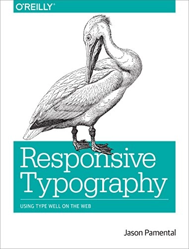
Responsive Typography Upplaga 1
- Upplaga: 1a upplagan
- Utgiven: 2014
- ISBN: 9781491907092
- Sidor: 103 st
- Förlag: O'Reilly Media
- Format: Häftad
- Språk: Engelska
Om boken
Responsive web design helps your site maintain its design integrity on a variety of screen sizes, but how does it affect your typography? With this practical book, graphic designers, web designers, and front-end developers alike will learn the nuts and bolts of implementing web fonts well, especially how to get the best appearance from type without sacrificing performance on any device. After examining typography fundamentals and the evolution of type on the Web, author Jason Pamental provides useful approaches, real examples, code, and advice for making your type performant, progressive, proportional, and polished - the primary ingredients of responsive typography. Understand how type plays a vital role in content-first web design Weigh the tradeoffs between self-hosting and using a font service to get the best performance for your site Get your type on the screen fast by designing for Progressive Enhancement Use a responsive relative scale to adjust proportions between typographic elements for any device or resolution Polish your type with ligatures, kerning, and other techniques to create rich, textured reading experiences
Åtkomstkoder och digitalt tilläggsmaterial garanteras inte med begagnade böcker
Mer om Responsive Typography (2014)
I september 2014 släpptes boken Responsive Typography skriven av Jason Pamental. Det är den 1a upplagan av kursboken. Den är skriven på engelska och består av 103 sidor. Förlaget bakom boken är O'Reilly Media.
Köp boken Responsive Typography på Studentapan och spara pengar.
Referera till Responsive Typography (Upplaga 1)
Harvard
Pamental, J. (2014). Responsive Typography. 1:a uppl. O’Reilly Media.
Oxford
Pamental, Jason, Responsive Typography, 1 uppl. (O’Reilly Media, 2014).
APA
Pamental, J. (2014). Responsive Typography (1:a uppl.). O’Reilly Media.
Vancouver
Pamental J. Responsive Typography. 1:a uppl. O’Reilly Media; 2014.
citeproc-js implements the Citation Style Language. (c) Frank Bennett. Licenser och källkod.